Thursday 27 September 2012

Graphic Designers

Paul Rand
Paul Rand
    Paul Rand was an American graphic designer, best known for his corporate logo designs, including the logos for IBM, UPS, Enron, Westinghouse, ABC and Steve Jobs's NeXT. HE was one of the originator of Swiss Style of graphic design


Paul Rand designed logos
MY WORK

  Zara  is a Spanish clothing and accessories retailer based in ArteixoGalicia, and founded in 1975 by Amancio Ortega andRosalía Mera. 


Michael Surrey 
Michael Surrey
Oftentimes it is at least somewhat predictable what animators will eventually become supervisors. A typical “rookie” supervising animator at Disney has usually either been a top animator at other studios for quite sometime(Eric Goldberg, Duncan Marjoribanks, Bruce Smith, Dale Baer), has worked at the studio for many years as a right hand to the top animators(Tony de Rosa, Broose Johnson), or has displayed blow-you-away skills from the minute they entered the medium(James Baxter). Sometimes, however, a young unknown animator who’s an unlikely choice to be a supervisor is assigned a character that is perfect for them and the person steps into the class of superstardom. That’s probably the best way you can describe what happened when Mike Surrey was selected to supervise Timon in the Lion King.


My drawing using Michael Surrey characters

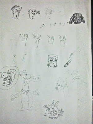
   Michael surrey is an animator and character designer. So i thought of designing few character myself and try to make the massage i'm try to send to the the viewer clearer.
For this Sketch i simply made a Evil man who's only intentions is to make money money and money , doesn't matter how he does it but he want money no mater what and how far he is willing to go 


Milton Glaser           
Milton Glaser
Milton Glaser (born June 26, 1929) is a graphic designer, best known for the I Love New York logo, his "Bob Dylan" poster, and the "DC bullet" logo used by DC Comics from 1977 to 2005. He also founded New York Magazine with Clay Felker in 1968.


  My idea using  Milton Glaser Designs 

    Milton Glaser's Design like I love NY , he uselessly used the the word or an image to convey his message. I used the same Idea behind that, But if u see my image what you will read is ''bulb stop smoking floppy disk " Which actually does not make any scene .

So here is what the following image represent:

Bulb : well in cartoon or movies we uselessly see when ever a person gets an idea there is a bulb image on top of his head to show that he got an idea or something.

No Smoking Sign: Its obvious Not to smoke.

Floppy Disk : Floppy disk where used to save files and even in computer when when we are about to save a file we can a small image of floppy to represent it and we can see i have put the earth below it just to show what are we trying to save.

So if we put them together we get " think if we actually stop smoking we can save earths environment or atmosphere"... 


   This Poster is completely based on his way of doing poster i have just brought in a little change to portray that we ourself are destroy the earth and eating it form every where and destroying it . We human are the reason of our own destruction 


El Lissotzky

El Lissitzky
Lazar Markovich Lissitzky  was a Russian artist, designer, photographer, typographer, and architect. He was an important figure of the Russian avant garde, helping develop suprematism with his mentor, Kazimir Malevich, and designed numerous exhibition displays and propaganda works for the former Soviet Union. His work greatly influenced the Bauhaus, and Constructivist movements and he experimented with production techniques and stylistic devices that would go on to dominate 20th century graphic design.


  My idea using  El Lossotzky  Designs 


   I was looking more into his work and then i found his one design where he played with word. I used almost de same concept and designed but changed the words to give it a different meaning. Where the word  ''P'' is represented as the protector or the protester leading the "EARTH".


   This Poster i designed for Global warming. Well know the antarctic is filled with  ice and it hugely effected because of global warming as ice melt that increases the water level up, But what About the animals living there, It there home that we are destroying. 

So this is just a simple design i came up with that a bear siting on top of Antarctica and trying to protect it 


Sunday 16 September 2012

Graphic Design:Grid System

“ The grid system is an aid, not a guarantee.
It permits a number of possible uses and each
designer can look for a solution appropriate to his
personal style. But one must learn how to use the
grid; it is an art that requires practice. ”
Josef Müller-Brockmann

What is Grid System?
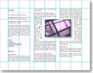
       The grid system in graphic design is a way of organizing content on a page, using any combination of margins, guides, rows and columns. It is commonly seen in newspaper and magazine layout with columns of text and images. One grid, or a collection of grids, may be used across an entire project to achieve a consistent look and feel. In a finished product, the grid is invisible, but following it helps in creating successful print and web layouts.
   A grid at its barest is nothing more than a series of intersecting horizontal and vertical lines spaced at regular intervals, but its innate propensity for creating order out of chaos makes it one of the most powerful tools at a designer’s disposal.

Basic Grid
Basic Planing Grid

Grid Anatomy 

Columns
 The vertical bands of modules. There can be any number of columns in a grid. More columns leads to more flexibility, but can also make the grid difficult to work with.Column widths can be equal or they can vary across a grid.
Rows
 The are the horizontal equivalent of columns. Online it’s harder to plan for rows as the height of the format is often inconsistent and dynamic.On some pages your design may call for a fixed height, though on most pages your design is allowed grow vertically with the content.
Gutters
  Are the spaces separating modules either vertically or horizontally. Typically we think of gutters as the space between columns, but they are also the space between rows.The minimum width or height of gutters should be an ‘em’ though this should usually be larger to better separate columns from columns and rows from and rows. The height of horizontal gutters should be based on the leading or line-height of the type.
Folio
 Are created when page numbers are placed consistently in the margin, usually above or below the composition.
Running Header or Footer
   A running header is a guide at the top to indicate your position in a manuscript. You’d find information like title, chapter title, section title, author, etc located here. A running footer is then this information is placed at the bottom of the format.
Markers
    Markers are placement indicators for subordinate or consistently appearing information. Markers can be used to denote the location of folios, page numbers, etc.
Grid anatomy
LAYOUT
    A layout is a place where you do your design and place text, images, colour, etc. using grid as a guide line.
   Gridded layouts represent geometric systems used to create pleasing dimensions in art and architecture. One of the oldest grid systems, the golden section, or golden mean, derives from nature and takes its cue from the early Greeks. It creates rectangles with a length-to-width ratio of approximately 1.62 and provides proportions that can be applied to any design task. Today's graphics software makes it easy to impose order on a layout using mathematical relationships among design elements.
   Grid layouts begin with an overall space and subdivide it into vertical geometric units. In a grid with two columns of equal width, all content must be created, cropped or scaled to fit one dimension and placed in one or the other of the two divisions of overall space. Grids made up of multiple narrower columns give you the freedom to define elements that span more than one column in width. Some grids remain purely vertical, whereas other design systems break up page height into grid units as well.


WEB BASE

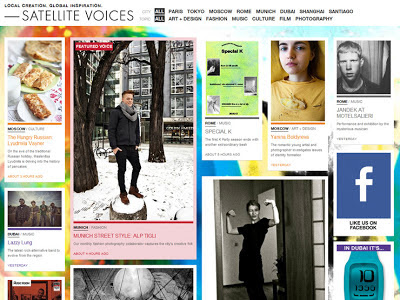
   In the last two years or so, grid-based layouts have become very popular in web design. A grid is a series of intersecting horizontal and vertical lines that serve as guides to place elements in a design. To put it in simple words, grids are a system for creating order among elements in a website.
Grids provide a common graphic language that makes it easier for both designers and developers to work on a website. It helps users to better understand the information as it's shown in a more structured and logical way.


PRINT BASE

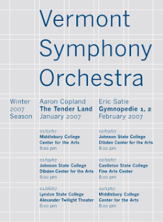
   A spread layout on grid: an important element in design. The design literally shows the grid lines and guide lines that was used in creating the layout. The base-line grids, margins, columns and gutters became visible design elements on the page instead of just being the invisible underlying structure.
   Used  in newspapers, magazines , book, clothing product etc. The contrast of text size ,image, color and the position the page creates a predictable of order.


TIME BASE

   A grid time base is usually used in video, television on our cell phones, etc. A good design for screen layout should be nocely presented and easy to read for the audience.


 Art Work Using the Grid System By Piet Mondrain

He was an important contributor to the De Stijl art movement and group, which was founded by Theo van Doesburg. He evolved a non-representational form which he termed Neo-Plasticism. This consisted of white ground, upon which was painted a grid of vertical and horizontal black lines and the three primary colors
   Mondrian began producing grid-based paintings in late 1919, and in 1920, the style for which he came to be renowned began to appear.
In the early paintings of this style the lines delineating the rectangular forms are relatively thin, and they are gray, not black. The lines also tend to fade as they approach the edge of the painting, rather than stopping abruptly. The forms themselves, smaller and more numerous than in later paintings, are filled with primary colors, black, or gray, and nearly all of them are colored; only a few are left white.
Mondrian produced Lozenge Composition With Four Yellow Lines (1933), a simple painting that introduced what for him was a shocking innovation: thick, colored lines instead of black ones. After that one painting, this practice remained dormant in Mondrian's work until he arrived in Manhattan, at which time he began to embrace it with abandon. In some examples of this new direction, such as Composition (1938) / Place de la Concorde (1943), he appears to have taken unfinished black-line paintings from Paris and completed them in New York by adding short perpendicular lines of different colors, running between the longer black lines, or from a black line to the edge of the canvas. The newly-colored areas are thick, almost bridging the gap between lines and forms, and it is startling to see color in a Mondrian painting that is unbounded by black. Other works mix long lines of red amidst the familiar black lines, creating a new sense of depth by the addition of a colored layer on top of the black one.
His painting Broadway Boogie-Woogie (1942–43) at The Museum of Modern Art in Manhattan was highly influential in the school of abstract geometric painting. The piece is made up of a number of shimmering squares of bright color that leap from the canvas, then appear to shimmer, drawing the viewer into those neon lights. In this painting and the unfinished Victory Boogie Woogie (1942–44), Mondrian replaced former solid lines with lines created from small adjoining rectangles of color, created in part by using small pieces of paper tape in various colors.
Broadway Boogie Woogie
My Layouts 

   For this 1 i had visited the Wednesday market that open every week near my university and saw how are the stalls arranged and used that arrangement to make the grid lay out.I divided  the stalls and the road and the footpath to get the simple look.

Rough sketch


For the 2nd i used my class room to find a gird layout by dividing the tables, space , door and the walking ares

Rough sketch


MY DESIGN
    
   Well just playing round with grid and having fun...I used the disco ball and thought how could i convert it into a heart shape like... just to show the love for dance.. don't know if i got it right.. so here's the rough sketch.


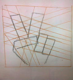
   For my Graphic design assignment is was asked to make a lay out using grid system. I thought of doing something different and use different materials. So I started looking around to get my grid layout, I looked at my class room the way the tables and chair were arranged in a systematic manner or the Wednesday market the way all stalls are arranged. But I wanted something different something that wouldn't look like bunch of squares or rectangles combined together. So I looked at hand and thought of ways to get a grid layout out of it.  I used the victory sign to represent peace and thought of ways to divide it into different layers to form a grid. I took one picture as a reference.

Reference

   Once that was done, i was thinking of  using  grid system to make and to fill color.. so i just came up with this rough back ground 
Reference 
   Using the back ground and over laying the hand sketch i got the basic guide lines i need to fill in color.
   I came up with something like this. Just a rough sketch to get the basic idea how i am going to go with this


   I stopped with the previous design and thought of doing something different with it. So using the same guide line idividing the fingers into different part, I thought of putting the hand in a box and make the lines long that I used as the guideline and make more line using the borders of the hand ash shown below:


   After dividing, making line and everything I removed the hand that I had drawn earlier. The lines that where formed gave me a layout and I used that layout further more to enhance my design.


   Later on I was asked to make an installation in the corridor with the gird that I had formed. I started looking for a suitable place and ways to how I should present my grid design. I thought of using threads nails and plastic bag to make my design on wall.
    I 1st made a rough design on the wall to use it as a guide. After getting the guideline I added the nails on the wall and attached each nail with another using thread as my grid design. After applying light on the thread it gave a shadow behind each thread.
   Then I added the plastic bag. I cut the pieces according to the shape and size of the places where I wanted to add it. The plastic pieces gave more shapes and shadow behind. The final front view is shown below.


My Digital design using Grid 


Tradutional Animation:Anticipation,Exaggerate, Arc and Solid animation

Exaggerate 
      Exaggeration is an effect especially useful for animation, as perfect imitation of reality can look static and dull in cartoons.The level of exaggeration depends on whether one seeks realism or a particular style, like a caricature or the style of an artist. The classical definition of exaggeration, employed by Disney, was to remain true to reality, just presenting it in a wilder, more extreme form.Other forms of exaggeration can involve the supernatural or surreal, alterations in the physical features of a character, or elements in the storyline itself.It is important to employ a certain level of restraint when using exaggeration; if a scene contains several elements, there should be a balance in how those elements are exaggerated in relation to each other, to avoid confusing or overawing the viewer


Rough Sketches 


       For this animation i did not use PhotoShop or any other Program. I just started sketching on paper one image after the other and clicked picture of them and made a video .... May be i can do better with time... 


Arc and Solid Animation
           Most natural action tends to follow an arched trajectory, and animation should adhere to this principle by following implied "arcs" for greater realism. This can apply to a limb moving by rotating a joint, or a thrown object moving along a parabolic trajectory. The exception is mechanical movement, which typically moves in straight lines.
        The principle of solid drawing means taking into account forms in three-dimensional space, giving them volume and weight.The animator needs to be a skilled draughtsman and has to understand the basics of three-dimensional shapes, anatomy, weight, balance, light and shadow, etc. For the classical animator, this involved taking art classes and doing sketches from life.One thing in particular that Johnston and Thomas warned against was creating "twins": characters whose left and right sides mirrored each other, and looked lifeless.Modern-day computer animators draw less because of the facilities computers give them, yet their work benefits greatly from a basic understanding of animation principles, and their additions to basic computer animation.

Anticipation
   An action occurs in three parts:
1.the preparation for the action - this is anticipation
2.the action
3.the termination of the action


   Anticipation can be the anatomical preparation for the action, e.g., retracting a foot before kicking a ball. It can also be a device to attract the viewer's attention to the proper screen area and to prepare them for the action, e.g., raising the arms and staring at something before picking it up, or staring off-screen at something and then reacting to it before the action moves on-screen. An example of this is the opening scene of Luxo, jr.. The father is looking off-screen and then reacts to something. This sets up the viewers to look at that part of the screen so they are prepared when Luxo, jr. hops in from off-screen.


   I tried using the Anticipation , Arc and Solid principles and came up with this.I'm sure with more practice ill do more better. 

Rough Idea


Video


Saturday 15 September 2012

Animation

My first 2 attempts for animation in Adobe Photoshop

1. Walk Cycle
       In animation, a walk cycle is a series of frames or illustrations drawn in sequence that loop to create an animation of a walking character. The walk cycle is looped over and over, thus having to avoid animating each step again.


Animation..
gif
gif

2. Squash and Stretch
        Squash and stretch is the phrase used to describe "by far the most important" of the 12 basic principles of animation, described in the book The Illusion of Life by Frank Thomas and Ollie Johnston

     When an object moves, its movement indicates the rigidity of the object. Many real world objects have little flexibility, such as furniture, however most organic objects have some level of flexibility in their shape.

     Take for example a bouncing ball. A rubber ball bounces higher and squashes more upon impact than a hard league ball. The ease with which an object squashes and stretches defines the rigidity of the material making up an object.


Animation..
gif